Richard L. Senninger
Personal brand site for a 3x National Award-winning hypnotherapist, author, and speaker — establishing thought leadership beyond the clinical practice.
The Challenge
Rick already had TIP Hypnosis — the clinical practice site. But the practice site couldn't carry his full identity. He's also a 3x National Award-winning counselor, the author of 10,000 Funerals, an independent consciousness researcher, and a speaker who gets booked by podcasts and conferences. Trying to do all of that on a clinical site would dilute both. He needed a second site — his personal site — that anchored him as the person, the author, and the researcher, not just the practitioner.
The Approach
Build the personal brand site as the deliberate counterpoint to TIP Hypnosis. Where the practice site is gold-and-purple and structured around services, this site is midnight blue with a starfield, anchored by Rick's signature in gold script. The clinical site sells sessions; the personal site sells Rick — his research, his book, his speaking. The two sites cross-link, but each owns its lane.
As Featured In
Richard “Rick” L. Senninger, CGC, CHt is the creator of the Transforming Individual Performance (TIP) Hypnosis Method — a clinical hypnotherapist, certified grief counselor, 3x National Award-winning counselor, independent researcher, and author of 10,000 Funerals – 5 Minute Life Lessons. This is the second site I’ve built for Rick. The first one — tiphypnosis.com — is his clinical practice. This one is him.
Why two sites
When you wear as many hats as Rick does, trying to fit everything onto one site does none of it justice. The practice site has to sell sessions clearly. But the practice site can’t be the home for a 200-page interdisciplinary white paper on consciousness, or for the book, or for the speaking engagements, or for the podcast presence — without diluting the message that brought clinical clients there in the first place.
The split was simple in concept: TIP Hypnosis sells the work. RichardSenninger.com sells the person. The two cross-link, but each one stays in its lane.
Design approach
Every decision here was made in deliberate contrast to TIP Hypnosis. The practice site is gold-and-purple — warm, authoritative, structured. This site is midnight blue with a slow-drifting constellation field — cooler, more contemplative, more “researcher and author” than “practitioner.”
The hero is Rick’s actual signature, set huge in gold script. Not a logo. Not a wordmark. His name in his own hand. For a personal brand site, that single decision does more than three paragraphs of “About me” copy ever could.
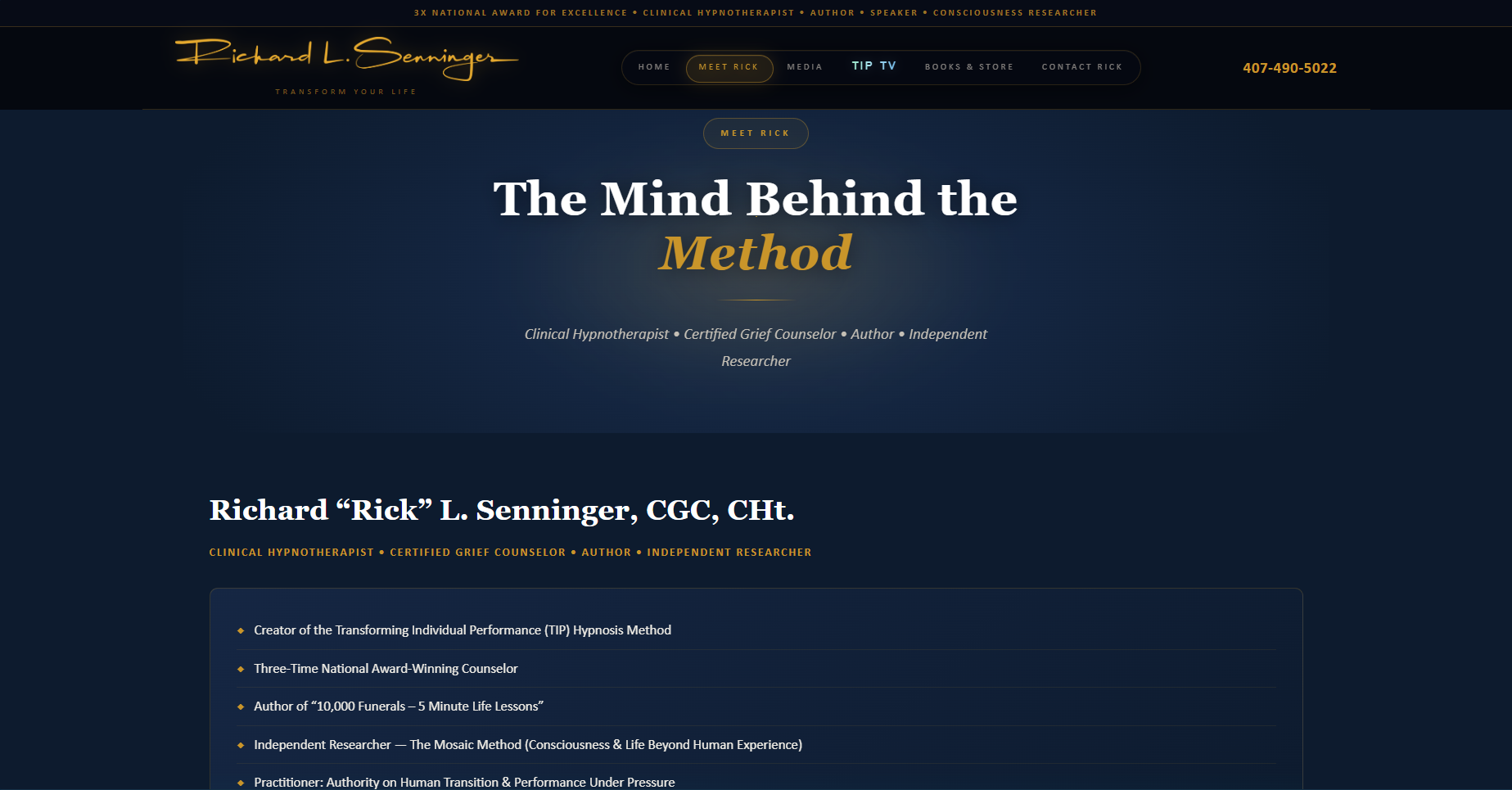
Typography uses a refined serif throughout — closer to a publisher’s book jacket than a medical practice brochure. Pull quotes are treated as editorial moments. The phrase “The Mind Behind the Method” on the founder page is set with the word Method in italic gold, sitting on its own line. Section dividers are thin gold hairlines. The whole thing reads like the inside cover of a hardcover, not a website.
What I built
Six pages, each anchored to one job:
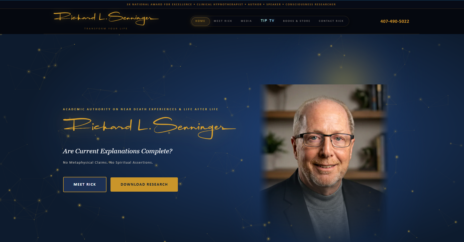
- Homepage — The signature, the headshot, two CTAs (Meet Rick / Download Research). Above the fold, the entire personal brand resolves in one frame. Below: a single pull quote, the Senninger Method positioning, the featured white paper (Life After Life? — Constrained Mosaic Convergence Method), and a four-tile navigation grid into the rest of the site.
- Meet Rick — “The Mind Behind the Method.” Full biography, credentials, professional memberships, and the personal narrative behind the work. This is the page that gets sent to producers, podcast hosts, and conference organizers.
- Media — Press hub: media bio, headshots, 1-sheet, producer sheet, and a Request for Engagement form. Built so a booker can grab everything they need without emailing Rick.
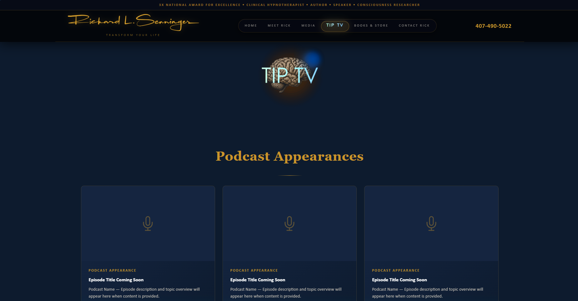
- TIP TV — A dedicated page for Rick’s podcast appearances. The glowing brain “TIP TV” mark sits above a grid of episodes. Cross-links to the TIP Hypnosis TIP TV page for the full library.
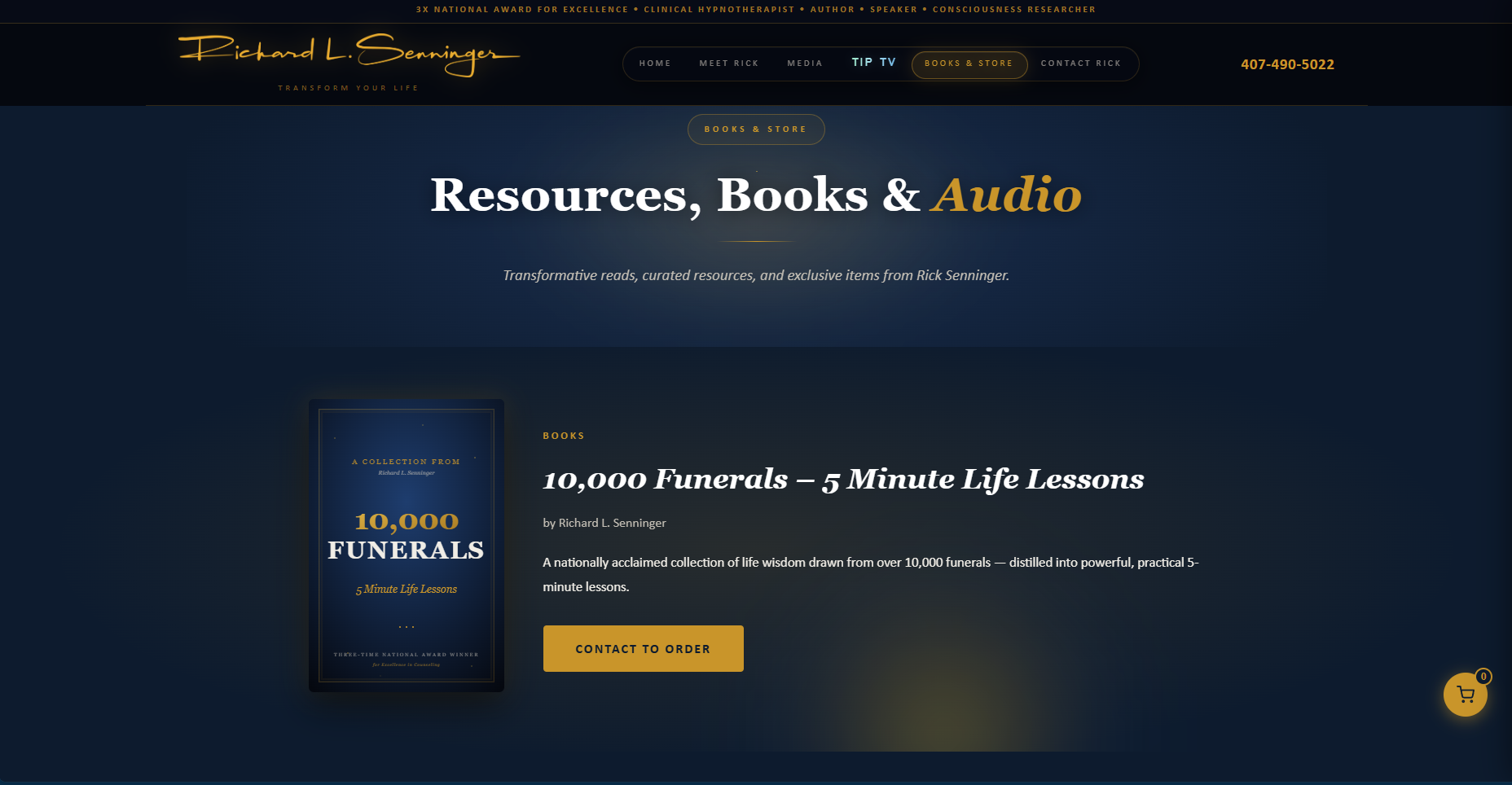
- Books & Store — 10,000 Funerals featured first with “Contact to Order,” followed by a Printify-powered merchandise store with Stripe checkout. Same backend pattern as the TIP Hypnosis store, different inventory.
- Contact Rick — Direct line. Personal, not clinical — this isn’t where you book a session, it’s where you reach out about speaking, press, research, or the book.
Technical notes
Same foundational stack as TIP Hypnosis (HTML, CSS, JavaScript, Stripe, Printify) but built as an Express application on Node.js with Docker for deployment to Railway. Brevo handles newsletter signups for The Inspired Thinking Bulletin. Products load from a products.json file at startup — a Printify catalog snapshot — so changes get deployed rather than fetched live. Trades a small amount of freshness for substantially faster page loads and zero API rate-limit exposure.
Why this matters
A lot of practitioners try to be everything to everyone on one site, and end up looking like nothing in particular to anyone. Splitting Rick into two purpose-built sites means each one can be sharp — clinical site for clinical clients, personal site for press, readers, and audiences. The combined picture is fuller than either site could carry alone.
If you have a parallel situation — a practice you sell, plus a book or research or speaking presence that needs its own home — that’s a conversation I want to have. Get in touch.